Archimedes Insurance App
This is a concept app design for a Swiss insurance company – I was asked to spend three weeks designing a new concept for insurance, both for onboarding and making claims. Their goal was to make the whole process much simpler – ideally doing away with long boring forms. This was a very challenging project with a lot of different stakeholders – each having a different opinion on user flows and requirements.
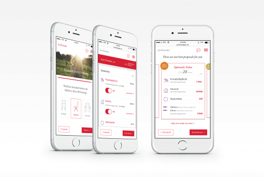
We investigated current user flows, analysing where current insurance users were getting confused and discovering moments where we could focus on making things easier. This solution included minimal questions in the onboarding flow, using image selection rather than text input. Consolidated packages – bronze, silver and gold – were then displayed in a clear and simple way to minimise choice stress.
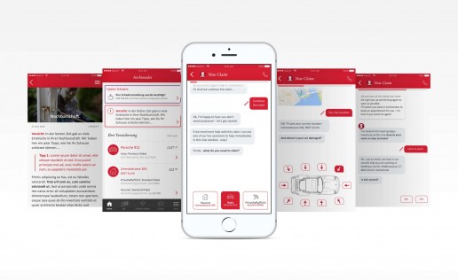
The claims process was also simplified – we chose for a chat based claim request where the user could quickly and easily apply for a new claim through the bot, in as few steps as possible.
My main focus in this short concepting sprint was to create user flows, wireframes and a few ‘sketch’ screens showing how the flows could work and really simplify the confusing insurance world.
ClientArchimedes Insurance ConceptServicesVisual Design, Interaction design, UX design, Strategy


